Photoshop Inspiration.

dreamache

New member
Jun 26, 2006
4,393
130
0
Been inspired big time lately browsing around on some of the designers at Dribbble.com. Huge site in which a lot of the top designers regularly post WIP type stuff on. I recently joined and became a big fan of a few guys there...

Dribbble - Mike | Creative Mints
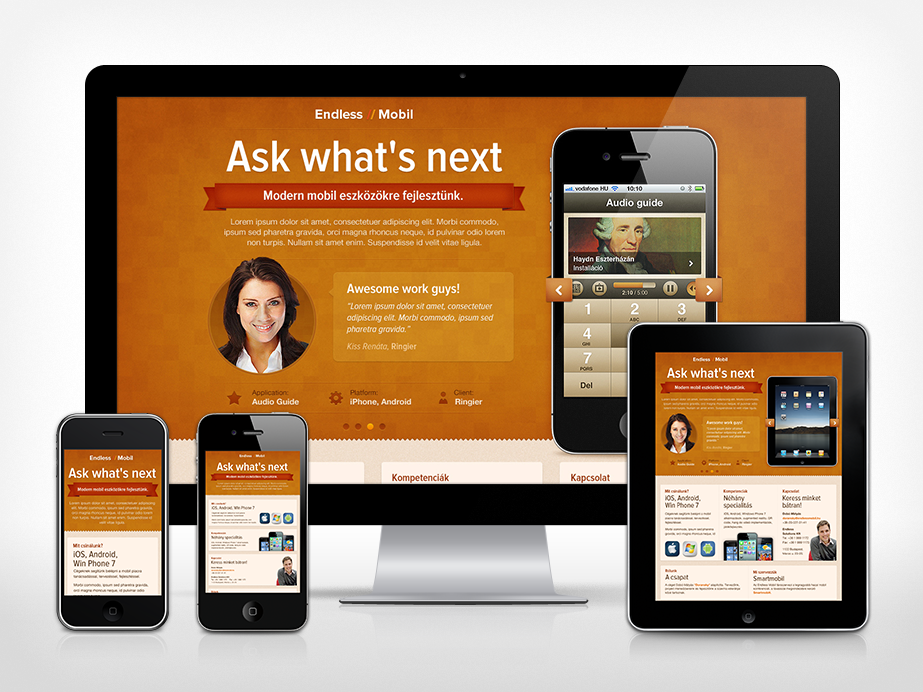
100% photoshop:
shelf.jpg


Dribbble - SoftFacade
devmate.png


Anyhow browse around on there, great site to gain some inspiration.. Here's what I've done since getting that inspiration..

wficon.jpg

dribbbleinvite.jpg


oh and I fucking want this: anyone got $2.6k for me?
[ame=http://www.youtube.com/watch?v=79SdxuA1WjY]CINTIQ 24HD - YouTube[/ame]


Pretty awesome site do u think these guys would get pissed if I scraped that site and reuse it?
 
Pretty awesome WF background you did. Would look nice as a desktop background.

I'm not a designer so I'm curious, those pictures you found are they sketched first then they work their magic on photoshop?
 
Pretty awesome WF background you did. Would look nice as a desktop background.

I'm not a designer so I'm curious, those pictures you found are they sketched first then they work their magic on photoshop?

Here's a link to a 1900x1200 bg I just put together.. The icon can't get any bigger since that's the biggest I designed it, but you wouldn't want anything much larger for a desktop bg like this imo anyhow..

wfprev.jpg


..and to answer your question, yeah the large majority of the time they're hand drawn/sketched first.
 
  • Like
Reactions: onkelmicha
dribbble is the shit.

I drool every time I look at logos and icons over there.

::emp::
 
Keeping on track with the designer stuff, how about them responsive designs?

previewLarger.png


Most people aren't yet aware of responsive design.. Basically single CSS, using media queries to adjust the layout based on the width of the browser, or device width.

Smashing Magazine they recently updated their layout. Check their site out with the browser width near maximized, then drag it in. We'll see this sort of thing become more and more prevalent.

Awesome site to check out responsive web designs:
Media Queries
 
Messing around with a few different rendering plugins and paint.net.

Pretty cool for a freeware image program anyhow.

AnbAc.png
 
Most people aren't yet aware of responsive design...

Some say that by sometime next year more people will be browsing the web on their mobile devices than on their desktops. Going forward, every site I design will be responsive. The biggest challenge is in keeping up with the constantly evolving mobile technology (hi res screens on small devices, a la Retina Displays and the competing equivalent, etc.) and the rapidly changing methods to fabricate and serve sites to such devices.

I've been preaching "mobile first" responsive design for some time now to other web developers but the advice often falls on deaf ears. Needless to say if the prophecies come true, which they will, and you're not delivering a mobile friendly version of your sites, you stand to lose a fair percentage of your business. Now is the time to plan for it.

Plus there's a lot of money to be made as a designer in this new golden era of web development.

Here are a few links to some of the responsive design resources I have bookmarked...

Responsive Images
https://docs.google.com/spreadsheet...HpzSmd6ZTdhbDdoN21YZ29WRVdlckE&hl=en_US#gid=0
» Preferred solutions for responsive images Cloud Four Blog
» Responsive IMGs — Part 1 Cloud Four Blog
Adaptive Images in HTML
https://gist.github.com/1893129
Sander Mangel: Responsive images trough .htaccess

Responsive Design
Olav Bjørkøy (bjorkoy.com)
10 Free Responsive WordPress Themes
20 Useful jQuery Plugins for Responsive Web Design - DesignModo
30 Creative Examples of Responsive Web Design | Inspiration
320 and up
A List Apart: Articles: Dive into Responsive Prototyping with Foundation
A showcase of mobile e-commerce | Webdesigner Depot
Beyond the mobile web by yiibu
Brett Jankord – Categorizr – A modern device detection script
Columnal | A responsive CSS grid system helping desktop and mobile browsers play nicely together.
Create a Responsive Web Design with Media Queries
CSS transitions & media queries » Blog » Elliot Jay Stocks
Developing a Progressive Mobile Strategy
Fingers are Bigger than Mice - Design Concepts for Mobile Websites | Codrops
Foundation: Rapid Prototyping and Building Framework from ZURB
Hardboiled CSS3 Media Queries | Stuff & Nonsense
How to Get Started with Responsive Web Design | Template Monster Blog
How To Use CSS3 Media Queries To Create a Mobile Version of Your Website | Smashing Coding
Introduction to Responsive Web Design - 1stwebdesigner – Graphic and Web Design Blog
Lessons from mobile web design | Webdesigner Depot
Media Queries
Mobile Boilerplate
Mobile Web Design | Best Mobile Websites | Mobile Website Gallery
Mobile Web Design Trends for 2011 | Template Monster Blog
Mobile-First Responsive Web Design | Brad Frost Web
More Responsive Design, Please « Jason Things
Overflow Image with vertical centering for Responsive Web Design
Patterns for Multiscreen Strategies
Picking A Mobile Support Strategy For Your Website | Smashing Magazine
Responsive Design Testing
Responsive Design with CSS3 Media Queries
Responsive Image Hierarchy « « Dave RupertDave Rupert
» Responsive IMGs Part 2 ? In-depth Look at Techniques Cloud Four Blog
Responsive Navigation Patterns | Brad Frost Web
Responsive Web Design Articles, Tutorials & Guides
Responsive web design from the future — Warpspire
Responsive Web Design Techniques, Tools and Design Strategies | Smashing Magazine
Responsive WordPress Theme | Reveal | Theme Trust
responsivepx - find that tricky breakpoint
Responsly.js Demo
Rethinking the Mobile Web by Yiibu
Screen Resolution
Structured Content First
The Myth of Mobile Context | Mobile Portland
Tiny Screens First | ThemeShaper
Using Media Queries in the Real World - Broken Links
http://yiibu.com/articles/rethinking-the-mobile-web/
 
Grid Systems and Layout Techniques (some responsive, some not)

#grid
24 ways: Compose to a Vertical Rhythm
40+ Helpful Resources On User Interface Design Patterns | Smashing Magazine
50 Free UI and Web Design Wireframing Kits, Resources and Source Files | Smashing Magazine
520 Grid System - HTML/CSS Framework made for Facebook Page Developers
52framework - The framework from the future, HTML5, CSS3, and more!
6 Tips and Tricks for Designing with the 960 Grid System | Web Design | CentreSource Interactive Agency Blog
960 Grid System
978 Grid System for Web Design
A List Apart: Articles: Setting Type on the Web to a Baseline Grid
A List Apart: Articles: Thinking Outside the Grid
Airbag - Ruler.
Designing Grid Systems For Flash | AisleOne
Andy Budd::Blogography
Canons of page construction - Wikipedia, the free encyclopedia
Carrer Blog: 1 line CSS Grid Framework
http://crowdctrl.com/2006/11/09/grids-make-eyes-happy
CSS with vertical rhythm | drewish.com
Design By Grid | Home
Design With Grids: 960 Grid System
https://www.designersbookshop.com/grid-calculator-buy.html
Designing With Grid-Based Approach | Smashing Magazine
Downloads- 978 Grid System for Web Design
Fibonacci number - Wikipedia, the free encyclopedia
Fluid 960 Grid System | 12-column Grid
Fluid 960 Grid System | 16-column Grid
http://fluid.newgoldleaf.com/
Fluid Grids—a fluid grid calculator by Harry Roberts
FluidGrids - A CSS Framework for Rapid Interactive Prototyping
Flurid - The Fluid CSS Grid Framework
Golden Grid System
Golden ratio - Wikipedia, the free encyclopedia
Grid and Column Designs
Grid Based Design
Grid Calculator
Grid Designer 2
Grid System Generator
Grid-based LayoutGAY- Interaction Design Pattern Library - Welie.com
Grid-Based Web Design, Simplified | Design Informer
GridCalc - Grid calculator and generator | Problem AB
Gridding the 960 ~ Authentic Boredom
GridFox for all your grid-based designing needs » Eric Puidokas » Programming and Designing for the Web
GRIDINATOR → All your grid are belong to us.
gridr buildrrr
Grids: show ‘em if you got ‘em
How to make wordpress themes using 960 grid system « WordPress 960
Introducing the LESS CSS Grid | Design Shack
Jason Santa Maria | Grey Box Methodology
Modulor - Wikipedia, the free encyclopedia
Negative Space in Webpage Layouts: A Guide
NineSixty (960 Grid System) | drupal.org
nP: Grid Generator - build your own custom css grid
Optimal width for 1024px resolution? ~ Authentic Boredom
Proportion (architecture) - Wikipedia, the free encyclopedia
http://www.subtraction.com/archives/2004/1231_grid_computi.php
Subtraction.com: Oh Yeeaahh!
Subtraction.com: The Funniest Grid You Ever Saw
http://s.robgoodlatte.com/demo/
The 1140px CSS Grid System · Fluid down to mobile
The 1KB CSS Grid by Tyler Tate :: A simple, lightweight approach
The Grid System
The Square Grid - A simple CSS framework for designers and developers
inuit.css—cooler than a polar bear’s toenails…
The 1Kb CSS Grid, Part 1
The 1Kb CSS Grid, Part 2
The 1Kb CSS Grid, Part 3
Using Landmarks Makes Page Layout Easy | Webdesigner Depot
Variable Grid System :: Generate CSS grid templates based on '960 Grid System'
YUI: CSS Grid Builder
 
  • Like
Reactions: dmnEPC