ZenSix has a new design. Opinions?

Status
Not open for further replies.

subigo

New member
Oct 20, 2007
3,993
104
0
46
TACOS $1.00!
zensix.com
While I really like our old design, it was hard to get all of the information needed on each page without making it look really crowded: Screenshot of old design

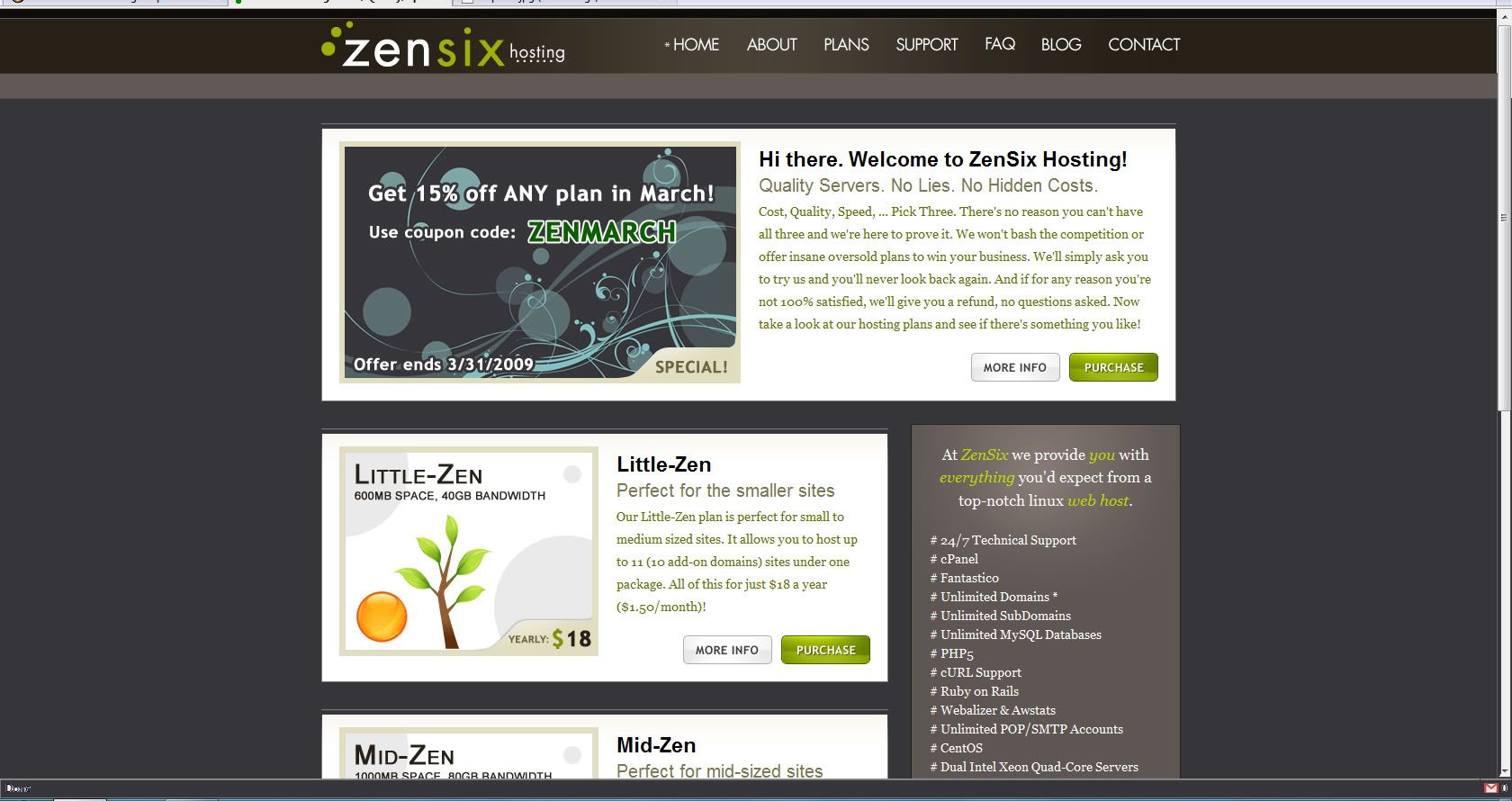
This is the new design and it helps us organize information a lot better. We tested it for a couple of days using geolocation and the conversion rate is as good, if not better than the old design, so I guess that's a plus.

Anyway, we made it live for everyone today and I just thought I'd see what you guys think...


Personally I think it looks kind of girly.

The colors are nice on the eyes.

It doesn't make me want to buy hosting though. It just doesn't have that "I'm a serious webhost" feel.

Think it makes me feel their are a bunch of hippies taking care of the servers. haha.
 
Looks very good. I really like the design and the layout.

What did you use for geolocation?
 
Personally I think it looks kind of girly.

The colors are nice on the eyes.

It doesn't make me want to buy hosting though. It just doesn't have that "I'm a serious webhost" feel.

Think it makes me feel their are a bunch of hippies taking care of the servers. haha.

That was my first impression too, lol. I don't know. I'm not against going back to the old design, but I'll give it a few weeks and look at the numbers before I decide for sure.

Looks very good. I really like the design and the layout.

What did you use for geolocation?

I'm not sure what exactly he did, but one of my support guys used Geolocation and Online Fraud Prevention from MaxMind and set it up. The script just looked at their IP and sent them to a folder with the new design if they were from the U.S.
 
old design wasn't bad, but new design does look much better. good call.

goyou6qi.jpg
 
Looking really good. Easy and yet stylish =)

Better then your old one imho.
 
Very well done and excellent color scheme but I'm not getting the hosting vibe. But then again, perhaps hosting sites in general need a makeover. So many cookie cutter Template Monster themes out there.

I would keep an eye on numbers. Maybe get together with your design guy and as a peripheral project, consider doing some hosting templates to push in some of the hosting forums as a potential revenue stream.
 
I like the new design very much.

One question, though: the orange circles / objects. Are they intentionally put with their respective sizes and number of circles in the different images for the hosting plans?
 
I like the new design very much.

One question, though: the orange circles / objects. Are they intentionally put with their respective sizes and number of circles in the different images for the hosting plans?

lol, yeah. More circles = bigger plan. But it just hit me that people might see that and think of asmallorange.com ... might be changing that too.
 
Another question... The new design with its current background, or this one:


Click for full size...

I just used the bucket tool to do it quick so I could get an idea, so some of the borders are screwed. But you get the idea...
 
Depends on how zen you want to get. I'd say the first for zenny and the second for hosty.
 
Subigo I actually quite like this new design. It most certainly is unique, having an Identity is always a good thing, esp in such a highly commoditized industry as hosting.
 
It's nice and clean in a wordpress blog sort of way, but as was said already, I also don't get that professional webhost vibe about it either.

If I were you, I would use that top promo area to display the 3 packages horizontally above the fold.
 
I changed the background and made it darker. I think it helps the content stand out more and takes a little of the "girly" look away.

Like everyone says, it doesn't give off the web host vibe and that's kind of what I was going for. Even if people don't like it, it'll probably stand out a little more and people will remember it... or not. We'll see...
 
I think you should do split testing ;)

(My opinion the old one is more Host like but if you're trying to be different then maybe the new one is the way to go.)
 
I agree with Fatbat - you currently present yourself as a cost leader, yet the main selling point is hidden below the fold. Since you are looking to differentiate yourself through the price (or so I assume), the design should only transport, not argue as an entity.

In other words: if you are a premium hoster, you can let the design speak for the brand; your brand will sell because it differentiates itself from its competitors through something they don't have - but you do.

But if you are a cost leader, then your USP should be your low price - and the design should occupy a supporting role only. Not to say that the new design doesn't fit - just the current layout is not beneficial for your positioning, in my opinion.
 
Forget all that pretty shit zubigo... make it just plain white and black with big bad signs pointing onto how much i would spend at godaddy and how much i would spend with you. Complete with a big nasty wickedfire logo on there.
Oh.. have some of the amazing testimonials nicely posted on there.
I dont care about trying to save the world with weed or whatever that design is supposed to make me do.. all i care about it .. do i know whos behind the servers i am using.
oh you are hiding the nitty griddy on the far fucking left.
# 24/7 Technical Support
# cPanel
# Fantastico
# Unlimited Domains *
# Unlimited SubDomains
# Unlimited MySQL Databases
# PHP5
# cURL Support
# Ruby on Rails
# Webalizer & Awstats
# Unlimited POP/SMTP Accounts
# CentOS
# Dual Intel Xeon Quad-Core Servers
# 6-8 Gigs of RAM
# 30-day Money Back Guarantee

Start with the money back guarantee... :)
Another thing.. fuck twitter, instead if you could have a very simple script that could email or text me when a server goes down - that i would kill for.
Sure i know thats alot for 30 bucks but it pays to dream.
Cheers man Keep it up.
 
When I click 'Purchase' on the home page on the Little Zen package in takes me to the plans page where I need to choose it again by clicking the 'Order Now' link in the relevant column. Thats like a whole other page for me to decide that i didn't want your product. I already chose to purchase, don't try and sell it to me again or give me a back out.

If you want to upsell do it at the checkout with a dropdown list or something.
 
Looks ok but it looks more like a personal design portfolio then a web hosting company. It's quite nice on the eyes but I think I'd rather buy from the old design.

Note: plans page has no footer.
 
Status
Not open for further replies.